Artist: Diosdado Lorenzo
Analysis:

The most disturbing and largest of the paintings is Diosdado Lorenzo’s Rape and Massacre in Ermita. The former head of the University of Santo Tomas Fine Arts Department painted it in 1947 at a time when the country was still reeling from the shock of the over 100,000 men women, and children slaughtered, bayoneted, and senselessly butchered in Manila in February 1945. The pain was so intense that many, to survive psychically, buried these events in the deepest recesses of their minds for many years. My generation had parents who were teenagers during the war and whenever they were asked about those times, spoke little and with much reluctance.

Lorenzo’s painting portraying two Japanese soldiers raping and killing family members in an Ermita home depicted a common horror not just in Manila neighborhoods but throughout many parts of the country. A young girl in the foreground is already dead from stab wounds, while another young girl with long hair in the background is naked and wounded. The husband has just been bayoneted. The wife struggling with a Japanese soldier clutching a knife, her breasts exposed, is about to be raped and murdered. A crying baby in a crib is a foreboding sign. There were countless stories by World War II survivors who saw Japanese soldiers flinging babies into the air and thrusting them with bayonets as they fell to earth. An altar with dangling rosaries is set on one side, mute and helpless. A tropical foliage seen from an open window vainly hides the fire and terror occurring outside.

Answer:
Mimetic-A bloodied artwork showing how the Japanese soldiers torturing Filipinos and abusing women sexually.

Pragmatic-To show the Filipinos how the conquerors tortured our ancestors.

Name: Andrade, Joey C.

images

REPOLLES, Monica Deyn V.

The Kiss Painting

According to the world art history, The Kiss is probably Gustav Klimt’s most famous painting of his so-called ‘Golden Period’ (1898 – 1908) when most of his masterpiece artworks utilized gold leaf. Klimt start The Kiss on 1907 when he was 45 and still lived with his mother, and finished in 1908. The Kiss painting is widely considered to be the greatest painting ever, better than even the Mona Lisa. What make The Kiss outstanding from other paintings? 1. Its art is made of modernity and a very close relationship with the erotism. 2. The artist seeks to give a dimension almost crowned to his fabric. 3. It represent the topic of the pressure in love. 4. The use of symbolic and gold leaf as per following explanation; A couple is intertwined on a floor of flowers resembling a meadow, it is wrapped in a full gilded clothing. The decoration of this cape, with the image of a mosaic, varies according to the sex: black and white rectangles for the man, of the coloured circles and the flowers for the woman. Of this emergent unit heads and the hands which constitute the expression of a great intimacy. The knelt woman gives herself to her companion the closed eyes and lets herself go to passion love. 5. The artwork evokes a world of harmony where the couple is insulated in sublimation from the feeling in love, being unaware of the world real and evolving in an unreal and idealized world makes of a great power in love. Klimt compared the sexual pleasure to the artistic joy and gave him a spiritual dimension. It was also particularly attached to the representation of the ideal beauty. What are interpretations of Klimt The Kiss? 1. The common gold shrouding, and indeterminate background evokes the timelessness, and union of selves that a kiss can engender. 2. The represents of how bright, beautiful, and golden everything is when you first kiss someone. 3. The man is lost in the kiss (faceless and unidentifiable) while the woman is turning her head away and is aloof from the kiss. 4. The female is succumbing to the male and experiencing a moment of sexual ecstasy. 5. A symbolic representation of the kiss of Apollo to Daphne at the moment she is transforming into a laurel tree (Ovid, The Metamorphosis). 6. The man is forcing a kiss on the woman who is turning away, but unable to escape. 7. The Kiss exemplifies a loss of self, reconciliation and unity that only lovers experience. 8. The couple stimulates opposing energies contributing to the connection. The man displays knowledge, black and white contrast, and binary information, as his energy towards the woman. The woman balances this by using her femininity, warmth, and decorous flowers as her energy towards the man. The woman is rooted in the ground, symbolizing her connection to “Mother Nature,” which means it’s only normal that she connects as the image of flowers. Underneath the man pictures of rabbits are visible and are benefiting from Mother Nature’s grass. This symbolism of balanced connection between the two parts is the essence of what love means. 9. Some think that Klimt and his beloved companion Emilie Flöge modeled for the masterpiece. However, this is not confirmed. 10. The Kiss is a discreet expression of Klimt’s emphasis on eroticism and the liberation therein. The Kiss falls in line with Klimt’s exploration of fulfillment and the redeeming, transformative power of love and art. The Kiss is deviant from Klimt’s frequent portrayal of women as the lascivious femme fatale. Why The Kiss painting could be a great gift to impress your loved one? The Kiss painting by Gustav Klimt is a fascinating icon of the loss of self that lovers experience. Only the faces and hands of this couple are visible; all the rest is great swirl of gold, studded with colored rectangles as if to express visually the emotional and physical explosion of erotic love.

Article from: paintings.analysis.blogspot.com


Villafranca, Hanna Jane O.

2.jpg


The Devil’s Music 2009

Description:
This two dimensional art work was created by the Chicago artist Tony Fitzpatrick in 2009 and is titled The Devil’s Music. The imagery in this mixed media piece is very graphic, set against a black background in a vertical format. There is a border around the entire piece made of collaged paper, inside of which are small diamond symbols, framing buildings and organic shapes. The center of the piece also features large orange text that says ‘No. 9’.
Interpretation:
The symbolism in this piece is first communicated through the words and numbers in the composition, reading ‘No. 9’. This number suggests that the piece is the ninth of the series, or perhaps the address of the building shown on the bottom portion of the composition. Fitzpatrick’s arrangement symbolizes organized chaos with scattered graphics in a variety of sizes, shapes, and colors. Each graphic is evenly spaced and rarely overlaps in perfect harmony. The border is straight like a perfectly fit puzzle giving a sense of control, while the bright colors visually pop off the page representing life and energy.
Analysis:
The contrast in this picture showcases the vibrant color of each graphic against a black background. This difference creates a sense of energy along with the variety of shapes and sizes in the work. The text ‘No. 9’ is an area of emphasis, or a focal point, in this composition. The color of the text is orange and is repeated in other imagery around the border to better unify the piece through repetition, or rhythm.


Judgment:
I think this piece is a success because I am drawn to the style, or aesthetic, in Tony Fitzpatrick‘s body of work. His style manipulates space, representative of the city lights and energy of New Orleans at night. His craftsmanship is exemplary, showing clean edges on each collaged piece further lending to the organized aesthetic of the mixed media work. The technique uses in layering printed paper against a black background is compelling and reminiscent of a specific time period. Through these strategies, Fitzpatrick communicates a feeling of a busy city with character and life, with references to media and print from the time

Mona Lisa

mona-lisa

Description

Painting: Mona Lisa
Date: 1503-06
Artist: Leonardo da Vinci (1452-1519)
Medium: Oil on wood
Genre: Renaissance portrait art
Movement: High Renaissance
Museum: Louvre, Paris.


Mona Lisa Analysis

The Mona Lisa, also known as The Gioconda, has gained the status of “the most famous painting in the world” due to a combination of various bohemian predilections and series of events, most of which evolved and took place during the 20th century. “The most famous” is not necessarily the “most beautiful,” as this extensive Wikipedia article appears to imply — but it undoubtedly is beautiful, and will remain such even if it loses its celebrity status.

The portrait, however, is more readily referred to as “enigmatic.” The ever elusive smile, the misty atmosphere, the hazy landscape in the background and, most of all, the ambiguous, inscrutable expression on the face of the sitter entrap the imagination, leaving questions open and fancy disturbed. Mona Lisa’s exceedingly serene, indifferent disposition further deepens the uncertainty and excites curiosity.

Indeed, the long-standing fascination with her visage could have a simple yet powerful psychological reason: we are often most interested in that which doesn’t seem to be interested in us.

Composition

The painting divides into three planes, unequal in importance and the space they occupy. First is the landscape in the background: it lends the image depth, as if letting it breathe, and counterbalances the protagonist; it itself divides into two complementing zones, the reddish terrestrial, and the bluish aquatic (and mountainous). The sky appears to combine the two tones, showing a blue azure touched with red and brown hues. Overall, the landscape creates a profound sense of harmony, matching the mystique of the lady with its own foggy atmosphere.

Mona Lisa herself comprises the second, and the primary, plane. Sitting in an upright position, with perhaps just a hint of tension in her neck and back, she as well can be compositionally deconstructed into two main areas: the upper, which includes the face and the chest, and the lower, which includes the arms and the hands. The third plane consists of a few vaguely visible, yet structurally important elements at the lower part of the panel: the armrest (or the seat-back), and the tentatively outlined balcony fence. These two parts delineate the immediate boundaries within which the figure rests.

Conclusion

Leonardo painted three other female portraits, all of which evince a considerably more legible degree of expressiveness, be it a display of pride and self-worth, or humility and nobility. They are easier to read, but they are, perhaps, less interesting because of that, giving away too much.

And yet the artist didn’t start a trend in portraiture where painters would seek to enshroud their models in mystery; on the contrary, psychological precision rather than ambiguity has become the universally sought for standard, including by some of the greatest visual artists.

Leonardo da Vinci: Mona Lisa (La Gioconda)

Approach:

This is Enigmatic because the author described the artwork in such a way that the artwork is very beautiful.

The author described each part of the artwork.

Art Critique of Back Porch Memories by Cheryl Metzger

13814644_1327996593880511_2024439077_n

MENDOZA, Marc Chad P.

ART CRITIQUE:

The simple elements of the still life connect the viewer with a feeling of nostalgia and evoke a sense of rural America. Even without the title, the painting takes the viewer to a home-like place, a time when life was a little simpler and less hurried. The elements of the painting are few and common to every household: a chair, four apples, a knife, a bowl and a towel. By limiting the number of objects, the artist is able to turn her focus to the composition and textural elements. It’s amazing what can be said with just five objects and a strong value plan!

Cheryl uses texture to convey the details of the scene. The glossiness of the apples conveys the freshness of the fruit, activating the senses, as we remember how apples feel, sound, taste and smell. This freshness contrasts nicely with the weathered tin dish, threadbare towel and worn wooden chair, things that have been well used many times before. The texture of the chair captures both the chipped paint and weathered wood, as well as acting as a record of its use. The contrast between the new apples and used household elements provides a variety of textures, and connects the present with the past, which is the basis for the narrative of this painting.

The limited color choices support the simplistic presentation of the concept. The reds and greens of the apples are natural complements, but the red and blue-green of chair carries this theme (loosely) into the rest of the painting. This blue-green provides a nice transition into the rich dark blue background, the unifying color of this composition. This blue background is the darkest value, to which all other values and colors are compared. Cheryl has punctuated her painting with this dark blue to give it the pop it needs to create visual interest and help move your eye across the composition. You can find these dark blues in the bowl of apples as well and in the shadows of the towel and the seat of the chair. The dark blues in the shadows provide depth and contrast, as well as help unify the painting and provide the framework for the light to cross the painting as it skips the shadows and hits the highlights.

APPROACHES:

  1. Mimetic Approach – This art work of Cheryl Metzger literally focuses on apples and show the simplicity of the painting. It’s a representational art because it portrays something which is in it’s true form. The painting mimics an apple, cloth and a wooden stool.

The Last Supper by Leonardo Da Vinci

Name: Duarte, Amiel Louie P. 


Leonardo_da_Vinci_-_Last_Supper_(copy)_-_WGA12732.jpg


The last Supper by Leonardo Da Vinci is the most representative painting of the Renaissance involving a religious theme.
The painting was on a fresco like-wall on the Palazzo D´Sforza as a task.

It´s a big mural that now is located at Santa Maria delle Grazie in Millan, Italy
Made by a composition of different elements that include some literal ones such as: Jesus and his Apostles, Landscape and a table with the last meal of Christ. Having a visual effect to the center of the painting he used a sad color paddle and a rough mosaic-like feeling.

Analyze:
In the painting we can see the different textures like the one of the tablecloth. The artist used the colors in a sad and dark way with a lot of shadows and sad color like blue, white and gray.
The artist tried to create an ambient where you could feel the divinity of Jesus and it very holy atmosphere.
The shapes are used in this painting to create the feeling of space like the squares and rectangles are the parts of the building in the painting they are used to make that. The lines were used to create space and the sensation of profundity in the back part of the painting and to create volume. The texture plays the role to decorate the clothes of the characters in the painting, also in the walls and the tablecloth, using the illusion of texture. The light in the work is very few, it´s more like a dark room with a lot of shadows, and also he used the dark value.

Interpretation:
The artist statement was to create a representative work on a famous palace. The meaning of it goes further than a single painting; we believe that he wanted to create the most remembered paint of Christ and his last meal.
To us it also means a way for people to see how the last supper of Christ was, it only relates to us in religion and maybe in culture because of it being a Renaissance painting.
The feeling that we have while looking at it is the feeling of balance, having everything in balance. Everything focused on the middle where Christ is.

Judgment of:

“The last supper”

The painting of the last supper is one of the most interesting and intriguing of all the times, because it represents one of the most iconic moments in human history and Cristian history, this was the night which Jesus announced before those assembled that o­ne of them would betray him.

In the painting Leonardo da Vinci has surpassed all others painters with its intense realism, instead of creating a mere representation of the scene  Leonardo captured a portrait-like quality in each face, demonstrating the emotion and dismay that the Apostles must have felt upon hearing that o­ne of their own would betray Jesus.


Aesthetic Form – the author of this article gave emphasis to the arrangement and organization of the elements of arts used in the painting.


Mona Lisa

YSON, Gleichel Maera G.

Mona Lisa

Artist: Leonardo Da Vinci

Analysis & Description:

The portrait shows the subject sitting upright and sideways in a chair, with her face and chest turned slightly towards the viewer: a posture derived from the ‘pyramid’ image used to depict a sitting Madonna. Her left arm sits comfortably on the armrest of the chair and is clasped by the hand of her right arm which crosses her front. The slightly protective position of her arms, as well as the armrest, creates a sense of distance between sitter and spectator.

The background landscape behind the sitter was created using aerial perspective, with its smoky blues and no clearly defined vanishing point. It gives the composition significant depth, although its details reveal a clear imbalance between the (higher) rocky horizon to the right, compared to the (lower) flatlands stretching away on the left. This imbalance adds to the slightly surreal atmosphere of the picture.

The Mona Lisa exemplifies Leonardo’s contribution to the art of oil painting, namely his mastery of sfumato. This painterly technique involves the smooth, almost imperceptible, transition from one colour to another, by means of ultra-subtle tonal gradations. Evident throughout the painting, Leonardo’s use of sfumato is particularly visible in the soft contouring of Lisa Gherardini’s face, around the eyes and mouth. It was a technique of oil painting that he had already demonstrated with great success in The Virgin of the Rocks (1483-5).

The general impression created by the Mona Lisa portrait is one of great serenity, enriched by a definite air of mystery. The serenity comes from the muted colour scheme, the soothing sfumato tonality, and the harmony created by the sitter’s pyramid-shaped pose and understated drapery. The mystery stems from a number of factors: first, her enigmatic half-smile; second, her gaze, which is directed to the right of the viewer; her hands which have a slightly unreal, lifeless quality – almost as if they belonged to a different body.

Approach:

The approach used by the author is Expressive because he tells how this artwork was related to the artist and how  Mona Lisa exemplifies Leonardo’s contribution to the art of oil painting, namely his mastery of sfumato. The author also described what he literally saw on the art work, he pointed out the things and the movements. Second approach is Aesthetics or Formal by describing the elements of art that can be seen in the artwork.


Camacho, David Andrey O. Title: River Landscapes by: Takeye Walter

serenity_hudson-_oil-on-canvas_landscape-water.jpg

The artificial vista of light disorientates and appears to play a little trick on the audience. I made an experiment: I viewed the piece from a standing position and from a sitting position. In the former case, the overall sensation was of strange instability, one approximately akin to being in water (standing or swimming) — which generally requires the sharpening of the senses (at least for a landlubber), prompted by the alien environment. The picture was so vivid that I felt a mild rush of adrenaline. Add to this the allusion to the biblical miracle of the parting sea, and you have all the components of a drama. Yet the paintings are evidently the exact opposite — peaceful and quiet.

APPROACH:

It is Aesthethic approach, because the painter used the different beuaties of Art . he experimented his art in making a different position and he found it more beuty.

De Castro, Gewel Mary M.

13820310_875587305906512_2122728708_n

Title: Cafe Terrace at Night

Artist: Van Gogh


Artwork description & Analysis:

Cafe Terrace at Night was one of the first scenes Van Gogh painted during his stay in Arles and the first painting where he used a nocturnal background. Using contrasting colors and tones, Van Gogh achieved a luminous surface that pulses with an interior light, almost in defiance of the darkening sky. The lines of composition all point to the center of the work drawing the eye along the pavement as if the viewer is strolling the cobblestone streets. The cafe still exists today and is a “mecca” for Van Gogh fans visiting the south of France. Describing this painting in a letter to his sister he wrote, “Here you have a night painting without black, with nothing but beautiful blue and violet and green and in this surrounding the illuminated area colors itself sulfur pale yellow and citron green. It amuses me enormously to paint the night right on the spot…” Painted on the street at night, Van Gogh recreated the setting directly from his observations, a practice inherited from the Impressionists. However, unlike the Impressionists, he did not record the scene merely as his eye observed it, but imbued the image with a spiritual and psychological tone that echoed his individual and personal reaction. The brushstrokes vibrate with the sense of excitement and pleasure Van Gogh experienced while painting this work.


Approach: 

The approach used of the art is aesthetic/form because the artist used different elements of art considering the descriptions above. This art also used a pragmatic approach considering the needs of the people at night whenever they need to do something that they need for the next day. It relates to the audience of the art.

Vitruvian Man by Lenoardo Da Vinci

Submitted by: ANTONIO, Khimsi Jane F.


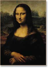
The pen and ink drawing by Leonardo da Vinci, depicting a man fitting his body to a circle and a square by adjusting the position of his arms and legs, is probably the most famous drawing in the world – judging by the fact that I see it in advertisements and worked into logos for holistic health centers and it is even the wallpaper design for my Windows main page. However, few people know its name or the secrets that it contains. It is called Vitruvian Man.

Vitruvius was an ancient Roman architect who wrote a series of ten books on architecture – one of the few collections of books of its type that survived into the Renaissance. In the third volume, which is on the proportions of temples, he states that these buildings should be based on the proportions of man, because the human body is the model of perfection. He justifies this by stating that the human body with arms and legs extended fits into the perfect geometric forms, the circle, and the square.

This fragment of the philosophy of Pythagoras seized the imagination of the Renaissance. Many artists tried to illustrate this divine relationship, but with varying success. An illustration of Vitruvian man by Cesariano in his Cosmo Vitruvius of 1521 reeks of failure. Cesariano drew a perfect circle and square tangent to each other at the four points of the square; then he forced a figure of a man into the design so that his hands and feet touch the points. The result was one of the most disproportioned figures of the Renaissance, with arms too long, legs too short, and hands and feet too big. A system of relationships alone did not make beauty happen. It took the genius of Leonardo da Vinci to solve the problem. Leonardo started by drawing a perfectly proportioned man and then found the circle and square in the figure. The circle and square are only tangent at one place, the base. The thing that he added was beauty. I keep a copy of his illustration on the wall over my drawing table and refer to it as a guide for my own figures.

I believe that beauty in itself is a greater mystical revelation than any system of symbols or of correspondences. The one criticism I have of Tarot decks in general, modern or other, is that at times they lack beauty. Sometimes the creators make the same mistake as Cesariano and try to make reality fit their ideas instead of discovering them in reality. This is not to say that there is no underlying wisdom in their assertions, but only that at times their solutions are less than satisfactory.

I have lived with Leonardo’s Vitruvian Man for many years now and it has taught me many things. It has been like having Leonardo as a teacher. I would like to discuss this further and show how this relates to the Tarot.

Some of you will be asking yourself, why was it so important to the Renaissance artists and philosophers that a human body could fit into a circle and a square? Some of you probably know the answer, but I will go into it for the benefit of those who do not.

The ideas that Vitruvius was expressing can be traced back to Pythagoras. Pythagoras lived in a Greek colony in Southern Italy in the 6th century, BCE, the same time that Buddha lived. Like Buddha, Pythagoras taught his male and female disciples that life is an endless wheel of reincarnations until we purify ourselves and return to our divine source.

Purification included a vegetarian diet, moral behavior, and contemplation of the numerical abstractions that underlie reality. Pythagoras was the first person to call himself a philosopher, which means to love Sophia (wisdom). We have no writing that can be attributed to Pythagoras; yet, he is one of a handful of people that were instrumental in creating Western culture. It is theorized that if he did write anything it would have been poetry and he would have signed it Orpheus.

Orpheus, the mythical, semi-divine musician, was the founder of the first mystery cult, a religion based on a secret redemptive ritual. This religion is believed to be a major source for the Pythagorean teachings. Many of its followers were poets and musicians who believed that their inspiration came directly from Orpheus; hence, they would sign his name to their work.

In the Orphic creation myth, the beautiful god, Dionysus, is born of the incestuous union of Zeus and Persephone. Zeus’ wife, Hera, is jealous and wishes to destroy the child. To accomplish this she has her allies, the Titans, dismember and devour him. Of course, Zeus is heart broken and in a fit of anger, he burns the Titans to ash with a volley of lightning bolts. Only Dionysus’s heart remained, and from this, Zeus creates a new Dionysus. However, from the ash of the Titans mixed with the devoured Dionysus, the human race was born. Therefore, the human race is part divine and beautiful like Dionysus and part vicious and material like the Titans. The purpose of the Orphic mystery was to redeem the Dionystic soul and make it the dominant influence in the lives of the devotees.

The Orphics, like Pythagoras, saw a connection between music and numerical order. This type of reasoning lead to sacred geometry. Pythagoras taught that numbers had qualities as well as quantity and that geometric figures were powerful magical symbols. The circle, being connected to the dome of the sky and the cosmos with its spherical stars and planets continually circling the earth was a symbol of Dionysus, the soul.

The square, on the other hand, is the natural way that humans relate to the physical world. This is why there are four directions, four seasons, and four elements. It is why my house has four sides and I am sitting on a four-legged chair while I write this on my square keyboard and read it on my square screen. The square was a symbol of the Titanic human aspect.

The first step to the liberation of the soul is to recognize that we are made of both aspects. In Pythagorean thinking, if a human can be shown to fit into both symbols this would be a geometric proof of our dual nature. Many of these teachings were incorporated into alchemy, and other ancient disciplines. In this way, the teachings – although at times fragmented – were passed on to the Renaissance. In Venice around the year 1500, Leonardo once again demonstrated geometrically that the human soul is divine.

Article from: http://www.thealchemicalegg.com/VitruviusN.html


The author  used mimetic way of approach on Leonardo’s artwork. Given that the subject of the artwork is a man, he discussed the proportion of the human body and how Da Vinci  fit it inside geometric shapes. On the other hand, he also discussed the connection of human to the physical world which is represented by square, that there are always four sides, four directions, and four seasons. The circle, tangent at one side of the square, represents the infinity of human reincarnation.